Showing posts with label design. Show all posts

Thursday, October 7, 2010

New Website: Design Section Complete!

Great news!  I have been working very hard and, with Gavin's help in scanning some items that I didn't have an electronic file of, I am now finished with the graphic design section of my new website.

Please check it out here: http://www.jsgreene.com/new/design and let me know what you think.  Try out the links -- let me know if the grey menu bar is missing.  If anything goes wrong, please let me know!  It needs to be fixed!

Now...onto the watercolors portion of the website!

Thursday, September 23, 2010

Where have I been??

Where have I been?  Well, I've been working on updating my website.  I am finding that it is taking awhile because I am trying things that are newer to me...expanding my skills a little.  So, I am learning and trying and fiddling with things to try to make them right.

One of the things I'm trying is using this one site called Typekit to import specialized fonts into my website.  For those of you who don't know, when designing websites, fonts are really tricky because each computer has their own set of fonts, that other computers may not have.  So designers typically use a handful of fonts that happen to be on every computer, Mac and PC.  It is very limiting.  I found out about this Typekit place, and basically they can imbed specific fonts on your website...for a price.  I thought that I'd try that out, but it's been difficult because when I build the website, I can't see what it looks like...I have to upload it and make it live in order to see how the fonts are working.  It's a lot of work, a lot of back and forth.

Anyway, it is more slow-going than I'd like it to be, but it's a challenge.  You can take a sneak peak at my new website by clicking here.  Right now, only the home page, the design page, and the website pages work.  Everything else will be a blank page or a file not found.  If you have any thoughts or suggestions, I'd love to hear them -- leave it in the comments.

You may also be wondering -- where is my watercolor painting for this week?  The answer is unfinished.  I had to leave class early on Monday to go to something and could only sketch the demo and take a picture.  I have since come home and done a fair amount of work on the painting (maybe 2/3 or 3/4 done), but haven't had time to finish it.  I'd post a pic of it, but Gavin took his camera to work, I think.  You'll have to wait.

Tuesday, September 14, 2010

A big difference in a little time

Returning from an afternoon out, I came home to find an email from one of my clients in my inbox.  As an aside, I really like all of my customers -- one of the benefits of doing freelance is choosing who you work with!  Anyway, I got an email from him asking if I had time to suggest a few quick tweaks to a flyer that they had drafted up for an upcoming seminar they are hosting.  I opened it up and saw the flyer (to the right) and thought, "Where do I even begin?"  Here I thought I was just going to give a few suggestions (like I did earlier in the week when they needed some suggestions for a simple flyer they were making), but I felt that the flyer needed a complete redesign.  How dull does this look?  Furthermore, are you supposed to be looking at the top half or the bottom half?

So, I sent a quick email back, getting more information about how the flyer will be used, and where it'll go.  My client explained that he needed it to go out ASAP and that it needed to be done in Word and also had to be emailed out to their email list.  So, I took a half hour before dinner and totally redesigned the flyer.

I am really happy with how it came out.  It looks professional, the color matches the official color of the company, the important, factual bits about the seminar pop out, but still remain a cohesive whole within the document.

I am not an accountant and the seminar seems way over my head, so I am likely not the target audience, but I think I'd be more likely to attend (or at least consider attending) the seminar from my flyer, as compared to what they would have sent out. I am glad that my client emailed for help--for what took me a half hour, they were probably working a good portion of the day on.  Now it looks better and hopefully will draw people to them, because they really do seem like they're a great company with a lot to offer, from my experience working with them.

Saturday, September 11, 2010

Design: Car Insurance Flyer

A friend of mine recently contacted me to create a flyer for her new side business of selling car insurance.  She needed a small flyer to be able to hand out to people as a promotional piece, to let them know of the services she offers and the discounts she can make.

Traditionally, the design for these types of flyers is colorful and noisy.  There's typically a lot going on and the eye does not rest easily on the page.  One of the sample flyers she sent me is to the right.  The colors are simple, but bolder.  The design is messy--the eye does not know where to go, what to look at.

My friend gave me the basic layout of her own flyer that she created in Photoshop. Like the standard ads, she wanted bright, bold color and a fancy car to grab attention.  She wanted to offer coupons and make sure to include all of the relevant points that might attract customers.

What I wanted to do was to make the design cleaner and more attractive.  I wanted her potential customers to be able to glance at the flyer and know what it is that she is offering.  To do this, I used the bright colors only on the important concept points of the flyer: the title, the phone number and the coupons/discounts that she could offer.  I also made use of size variations of fonts, to help direct the viewer's eye, so that not everything has the same weight and importance.  This is a lot of information in a little space (5.5"x4.25", or 1/4 of a sheet of paper), and so as a designer, I have to help prioritize for the viewer the eye-catching, important, big-picture concepts.

What was a new learning curve for me was that I had to take this same flyer that I created in English and re-create it in Spanish.  My friend wanted one side to be English and the other side to be Spanish, because she is trying to build a bilingual insurance business.  At the beginning of this project, I thought that would be an easy step, but I learned that it can actually be a design challenge.  The design I had created worked really well with English words, but when translated into Spanish, I needed to make choices about how to display the information when some of the words and phrases were either much longer or much shorter than the English wording.  For instance, in the red starburst, the $0 down works really well as a unit.  Seems balanced in the space.  But if I were to do that exact same placement of words in the Spanish version, it would throw the whole starburst out of shape.  Likewise, with the coupons, I had to widen the shape of the coupon and adjust the wording placement so that it would fit and not look funky.

All in all, both my friend and I are really pleased with how the flyer turned out.  And it was great experience for me to be able to figure out how to do the same design and create the same look and feel, but with different wording content.

Friday, August 13, 2010

You can think this is easy until you try it yourself

Me with the finished product.
About a month ago, I saw a brief article in the L.A. Times that was telling of a florist in Venice that was offering periodic floral design classes.  Thinking that it'd be something fun to do, and thinking that it might be a nice thing to take my sister-in-law Carrie to as a thank you for helping me so much with my wedding, I signed us up.  Carrie selected the "Modern Masterpieces" course.

The class was last night and, upon entering the design studio and seeing our project, I felt like we were being ripped off.  It looked easy.  Too easy.  I mean, it was just a bunch of leaves in one of those thin, straight, rectangular vases.  How wrong I was.

You can sort of see the
layers of the arrangement
from this angle.
After the demo, Carrie and I set off to making essentially what the teacher did.  First by sticking in some tea leaves to create a backing.  Relatively easy.  Check.  Then we had to stick in these flax leaves to create the backdrop for the orchids (I guess those green things are orchids...I did not know that).  Sticking in those flax leaves, believe it or not, was a little more difficult because they kept squirming around.

But, finally, I got the flax to stop squirming and then tried inserting the orchids.  This is when it turned out to be incredibly hard.  First of all, you sort of have to squash the orchids so that they can fit in the thin space of the vase, but they can't look too squashed.  Furthermore, they're very delicate (and easy to poke holes in, which I tended to do.  Third, they totally misaligned the flax leaves that I had worked so hard to make perfect.  So there was a good portion of the night where I was just trying to move everything slightly to get it perfect again.  I never did achieve that.
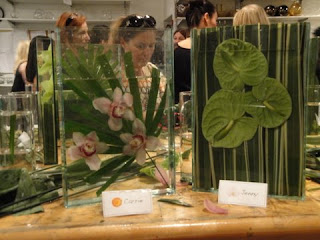
Carrie's arrangement is on the left, mine on the right.
Neither did Carrie.  We started out with almost identical projects.  But she got so frustrated at one point that she totally scrapped that whole design and tried one of the other versions, where you take a palm frond and cut it so that it fit in the vase.  Then, she carefully floated orchids in the vase.  This type of arrangement seemed to be much easier and less complicated, but still had its problems.  However, I think we were both relatively surprised when we walked around at the end of class that our arrangements were average to above average compared to our classmates', which was most definitely not expected after all of the troubles we encountered.

When I registered Carrie and I for the class, they said that if I bought 3, the classes would be slightly cheaper.  I had interest in many of their other classes, but most particularly in their holiday wreaths workshop being offered in November.  So, stay tuned for more floral designs to come!